
What statistics will I use as a first-time manager?

Hey there!
Bet some of the words in this title are kind of putting you off, aren’t they? I don’t blame you! You see Data and Statistics in one place and you will assume the worst. It’s a normal reaction, especially for the first-time manager, so don’t worry about it too much. Today we will demystify the ever-fearing concepts of statistics, and get you on the right path without causing any headaches.
In today’s article we will talk about and showcase the core elements – the basics if you will – that a new manager should know and use. If you want to take it from zero, I recommend you first check out this article Understanding Data Types in Daily Operations. It’s an introduction to data types, and will be very helpful in trying to make sense of everything we will go over today.
- The Intro: Why do we need all this data in leadership
- The Overview: Types of Data, Sample, Population, Data Hygiene Essentials
- The Central Tendency: Mean, Median, and Mode
- The Spread: All about variation
- The Visuals: Choose the right chart for your story
- The Toolkit: Key Aspects to Master in Excel
- Final Thoughts
Part I. The Intro: Why do we need all this data in leadership
If you are a fan of this Knowledge-Base, you know by now the story: you made a big leap in your professional life and changed from the Individual Contributor to the People Manager. With this change comes a shift from “doing the work” to managing outcomes. Outcomes are measured with data and there’s just no way around that. While we retain a small amount of “gut feeling” that we can use from time to time to assess different situations, proper decision-making as a leader will require data mastery. Of course, when we say data mastery we don’t mean a high-level mathematician, don’t worry about that. We mean a person that has the ability to use data and tell a story. This is what you will be doing from now on as a people manager: Tell a Story using data!
Everything you do, your team does, and all the aspects of your process can be translated into data. In essence we are looking at: People, Workload, Process, Customers, Performance, and Financials.
1. People
- Profile & Tenure: Role, company/industry tenure, time since last promotion, location, working mode.
- Skills & Capacity: Certifications, core competencies, salary band, working hours vs. overtime, leave balance.
- Sentiment: NPS, 1-on-1 sentiment, peer feedback, retention risk.
2. Workload & Tasks
- Volume & Attributes: Incoming requests, backlog, priority (P1–P4), task complexity.
- Efficiency & Flow: Cycle time, lead time, estimated vs. actual hours, reassignments, handoffs.
- Quality: Rejection rate, rework rate, error counts.
3. Processes & Workflows
- Architecture & Compliance: Step count, approval layers, SLA compliance rate, process deviations.
- Throughput & Tech: Bottlenecks, operational yield, % manual vs. automated tasks, tool utilization.
4. Customers & Stakeholders
- Satisfaction & Volume: Client tier, request frequency, CSAT, NPS, complaint volume.
- Interactions & Impact: First Response Time (FRT), resolution time, touchpoints per ticket, retention rate.
5. Performance & Growth
- Goals & Progress: OKR/KPI target achievement %, variance, progress trends.
- Development: IDP milestones, skill gaps, peer recognition, formal feedback.
6. Financials & Resources
- Budget & Assets: Budget vs. actual spend, training spend per head, hardware age.
- Efficiency: Cost per output unit, overtime spend, tool license utilization (assigned vs. active).
Part II. The Overview: Types of Data, Sample, Population, Data Hygiene Essentials
Working with data will of course require a brief introduction, so let’s break it down into categories.
Types of Data
We classify data into 2 major brackets: Quantitative (Discrete and Continuous) and Qualitative (Structured and Unstructured):
- Discrete: your basic categories. Discrete data is data that can’t be broken down into fractions without losing its significance. For example: Pass/Fail, Yes/No, Man/Woman, Left/Right, High/Medium/Low, etc. When you look at these numbers, you can’t break them into fractions — you can’t say “half pass” and “half fail”.
- Continuous: your basic measurements. This category can be broken down into fractions without losing its significance. For example: temperature in the room, duration of a call, height of a person, weight of a person, etc.
- Structured: is all about categorized or coded feedback (e.g., standard drop-down reasons, reason codes for escalations, binary survey responses). Out of the two, this is easier to work with as it can be easily aggregated into numerical trends.
- Unstructured: is all about free text – long, very difficult-to-work-with blocks of text that come from all sorts of places: free-form text responses, interview transcripts, direct customer feedback notes, etc. Nowadays, it’s a bit easier to work with as we have plenty of tools that can help translate whatever is going on in the text into a more analytical view.
The Sample
To make this concept easy for everyone, think about it like this: I need to check if the people in my city are willing to pay extra taxes to build a new hospital. I can’t go and ask every single person in the city, that’s just not possible. So, what do I do? A simple way is to look at all the people, break them into categories (by age, gender, income, location, status, etc.) and from each category select a specific number that will be sufficient for me to get an idea of what they are thinking. A sample is a proportion of the entire population (all the people in the city) that is specifically selected to be an accurate representation of that population.
In operations, samples are essential to master, because they can be used to assess different parts of your process and/or people when needed. If not used properly you get really bad outcomes. Let’s say you need to change the target for a KPI and you make a poll and ask people to see how they will react. If you only send the poll to high-performers or people with experience, you only get part of the story. You might say “aa, look they are OK with this”, but when you actually change the target you get major push-back.
The Population
This one is simple: it’s everything you want to observe. If you have a big dataset (let’s say with customer payments), the population is every single record in that report. If you are talking about your team, the population is made of every single member of your team.
The trick is to know how to look at Sample vs. Population and when you need to use either of them. Sometimes it’s just not possible to measure or observe something for the entire population, so you end up with a sample. Other times you have to measure the entire population because it’s the only way to assess something.
Data Hygiene Essentials
When dealing with data you must remember: clean data is the only data. When working with a messy report, missing columns, incomplete values, wrong formatting, etc., it will severely impact your outcome. Data must be clean and neat, otherwise you can’t get any reliable information from it. Each time you get a report you need to analyze, make sure it’s clean, structured, doesn’t have any missing values, columns make sense, and the formatting is OK.
Part III. The Central Tendency: Mean, Median, and Mode
Central tendency is all about location. Don’t worry, you use these concepts more than you think. There are 3 components to this that we use all the time in operations: mean, median, and mode. So, let’s break them down and make them easy to digest.
The Mean aka the Average
This is the easiest one: it is the sum of a set of numbers / the total number of numbers. Let’s take this example: what is the Mean of this: 10, 20, 15, 25. It is (10 + 20 + 15 + 25) / 4 = 70 / 4 = 17.5.
The mean is used so much these days it is impossible not to know it. It’s basically a core component of operations and daily life. Speaking of, in operations we usually use it when our datasets are stable and do not have outliers.
The outlier is the value that is either way too low or way too high. To understand why these are relevant, let’s take an example: you get a salary table with different roles and salaries.
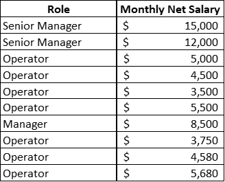
If I say the average salary in this company is $6,801, would that be a fair statement? Well, not really. Overall, yes, 100% that is the average; however, if I join as an operator, my average salary would be somewhere around $4,600 – because the rest of this data has other job functions that influence the overall value. They are called outliers, and when working with the average this is what happens: outliers tend to pull the mean either higher or lower.
Excel function: =AVERAGE()
The Median aka the Exact Middle Value
The median is basically your average without outliers. It is the exact middle value of a set of numbers if they are arranged from smallest to highest or vice versa. Unlike the Mean, the Median is preferred when working with skewed data, resolution times, salary comparisons, or any type of metric that has outliers.
A much more valuable tool to use, the median can help us understand what is going on in a dataset when the average doesn’t really make any sense. Let’s take for example the salary table we had for the mean. The average was $6,801; however, if we calculate the median we see that it is in fact $5,250, a much closer value for our example (say the Operator salary). This is because it removed the bigger values that it identified as outliers.
It’s the same with any dataset with lower or higher values that are dragging the mean up or down. Each time you have too many of them, replace the average with the median and you will get better results.
Excel function: =MEDIAN()
The Mode aka Most Repeated Value
The mode is very simple as a concept: the value that shows up the most. In a dataset (1, 5, 2, 9, 2, 8, 2, 3, 7), the mode is 2 (the value that appears the most). Its use is more specific and not as common as the Average or Median, usually for: identification of recurring issues, top contact reasons, or frequent error types.
Excel functions:
- =MODE.MULT() – returns multiple modes (in case of a tie)
- =MODE.SNGL() – returns the only mode value available
Part IV. The Spread: All about variation
Variation is… all around us. It’s actually one of the most present aspects in the universe. There are no two exact things alike. Well, sort of. At its core we can see it best between us, humans: different looks, heights, weights, eye colors, shapes, tones, hair… you name it. Following this logic, we also find variation in processes and teams: people don’t have the exact same AHT, or the exact same quality score every single time. And this is normal, until it’s not. You see, the thing with variation is this: too much of it can cause severe issues in a process.
To help you better understand the concept, let’s play a little game, shall we? Below there’s a table with the results from 2 teams (A and B) for 20 days (1, 2, 3… 20). Now that you are an expert in Mean and Median, why don’t you calculate them in Excel and see what the results are?
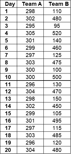
So, let’s take a look, all of us, and see what they look like.
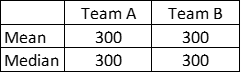
Is there anything wrong with this picture?
Well, not really – at least not by looking at these numbers!
In reality, however, one team has some serious issues that they are not aware of. If we calculate the variation of each team we can see where the problem is. To do that we need to introduce another concept called the Standard Deviation.
I know, it sounds so statistical and complicated, but it’s really not. Standard Deviation (StDev) is just a way of saying how tightly clustered or spread apart data points are compared to the mean. This is important because it provides a great health picture of that process: the more variation you have in a process, the worse it gets. Remember when we talked about Spotting and Eliminating the 8 Types of Waste (DOWNTIME)? I was telling you guys a bit about Lean and Six Sigma, where Lean is about waste and Six Sigma is all about variation control. Well variation, when left unchecked, can cause severe process issues. This is why now we don’t really like it. All products look the same, have the same cost, etc. High variation in your process will cause: Operational and Customer Impact (misleading KPIs, severe SLA breaches, capacity and staffing misalignment) and Team Impact (unfair performance evaluation, increased employee stress, loss of engagement).
So how do we extract this variation? Well, it’s a very simple Excel formula:
- =STDEV.P() – when our dataset is the entire population
- =STDEV.S() – when our dataset is just a sample
Now let’s look at the exercise we did a few moments back and see the full picture.
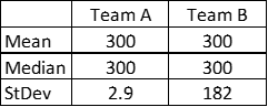
Seems that Team B has a variation of 182 as compared to Team A, meaning there are too many differences in Team B, it’s less stable and potentially problematic. Remember: the higher the variation, the worse things are.
Part V. The Visuals: Choose the right chart for your story
Every time you work with data you are telling a story. In order for the story to have a great and captivating narrative, you need visuals. For data, these visuals are the charts. So, let’s take a look and see what is what.
Bar Charts and Column Graphs: Best for comparing discrete categories or tracking metrics side-by-side.
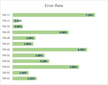
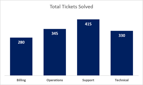
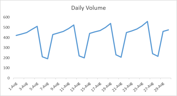
Line Charts: Essential for viewing trends, patterns, and seasonality over time.
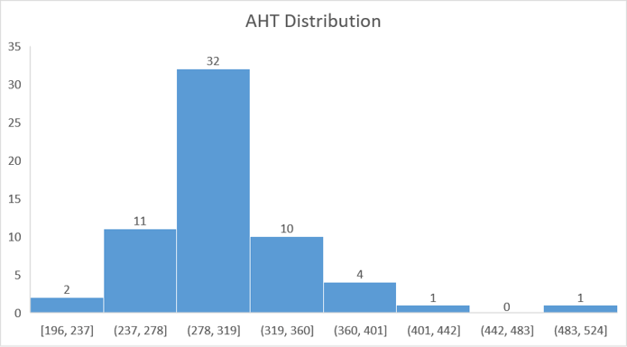
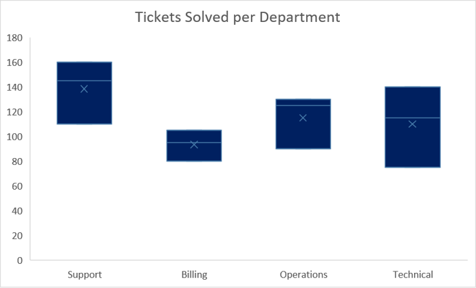
Histograms and Box Plots: Ideal for spotting distribution shapes, variance, and outliers.
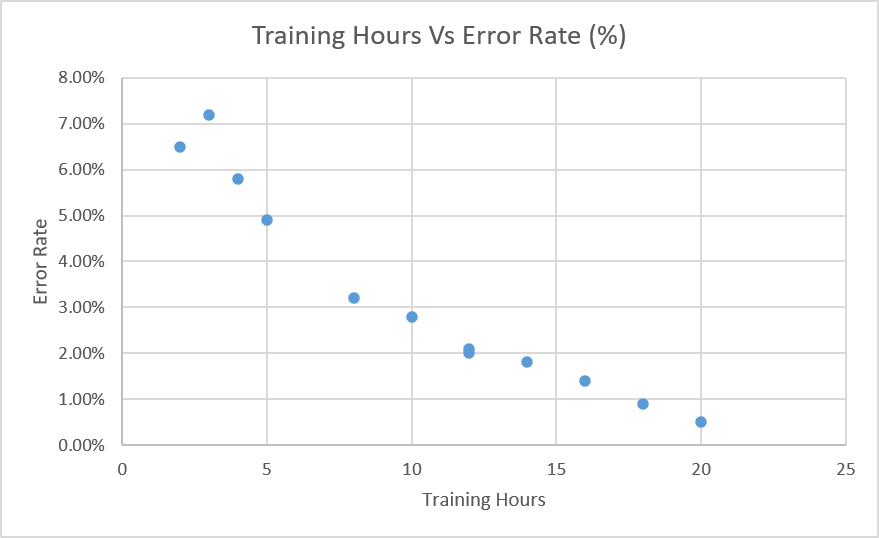
Scatter Plots: Identifying correlations between two operational variables (e.g., training hours vs. error rates).
We will have more articles on the topic of proper data visualization in the future; for now, however, I do want you to remember The Golden Rule: If a visual requires a 5-minute explanation, it’s the wrong visual for your stakeholder meeting.
Part VI. The Toolkit: Key Aspects to Master in Excel
To help you guys, at least the ones that need a bit of help at the start, I created this template in Excel. In the first sheet you just have a very basic Data Column (here you just add whatever data you need – just make sure you delete mine), and then the Mean, Median, Mode, and StDev will be populated automatically. In the second sheet you will find some dummy data, tables, and different types of charts (the ones we talked about above).
Feel free to use it each time you need to or to give you a bit of digital courage to get you started with data analytics.
Final Thoughts
Since this was a longer article (but one filled with useful information, I hope), I just want to give you guys a bit of “go for it” advice: don’t be scared of data or of these basic statistics. Trust me when I say this: everyone can learn and use data to their advantage. You just need time and lots of patience to understand and use them. It will be frustrating at first, you will get mad and/or discouraged, but give it time, practice-practice-practice, and it will come to you.
When you need some visual learning, please check out this YouTube channel; she is truly a master at teaching people everything about Excel: https://www.youtube.com/@LeilaGharani
Stay healthy, safe and happy! Help others as much and as often as you can!