
How do I measure where my team is starting from?
Let’s assume you are a bit more familiar with your new team: you know the people, you have a basic understanding of what each person is doing, the customer is starting to get to know you, processes are a bit clearer, and overall things seem to be going in the right direction. Then you get an email with the subject “please help me with the baselining for the following KPIs”, and you start sipping your coffee and asking yourself, “What is even baselining?”
Like most first-time managers, your very first baselining exercise will be a hard one – not because the math behind it is complicated, but because you have had no exposure to this before. It is absolutely normal to feel this way. If you take a step back, try to relax, and think about it, it’s really not that complicated; you just don’t have one important ingredient: a structure, a framework if you will, to help you out.
What are the steps I need to do for a baselining exercise?
To establish accurate operational baselines and realistic targets, first-time managers must clean their data, filter out abnormal outliers, and separate distinct workflows; they can then determine team capacity using the median as the baseline – supported by 25th and 75th percentile target bands and capability analysis – to safely improve performance by streamlining processes rather than arbitrarily shifting goalposts.
Your first baselining RoadMap:
| STAGE | FOCUS AREA | KEY POINTS |
| Establishing Accurate Operational Baselines | Framing the initial challenge new managers face when tasked with baselining and introducing a structured framework to measure starting performance. | Recognize baselining as a manageable, structured process and prepare to evaluate your team’s starting point step-by-step |
| The Numbers – You Can’t Do Anything If You Don’t Understand | Cleaning data, removing abnormal outliers, segmenting operational shifts, and performing core statistical calculations to identify the true median baseline. | Inspect column definitions, clean missing or corrupted data, remove abnormal outliers, split layered datasets, and calculate key statistics to use the median as your baseline. |
| Establishing Your Targets | Defining a realistic three-tier target band, validating process capability, and adjusting underlying process inputs before shifting performance expectations. | Set a three-tier target band based on quartiles, run a capability analysis, and optimize operational inputs before attempting to raise performance expectations. |
The Numbers – you can’t do anything if you don’t understand
The first thing one must do for a successful baseline exercise is to have access to the data needed. Data, as we know, comes in many shapes and forms, and for this exact reason, there are a couple of things we need to do before we even begin any calculation. We will take them in a logical order. Before you go into it, you might take a look at these articles; they offer an overview of the more statistical side of management: I’m Not Good with Data: The Non-Analytical Lead’s Guide, Data Types: A Beginner’s Guide, and Intro to Statistics: A First-Time Manager’s Guide.
Understanding your data
Sounds a bit strange, but this is actually a very important step that a lot of less experienced managers tend to skip. They will assume they know what the database is all about and just fly over it. In reality, understanding your data is the first and most important step you need to take, because without a proper picture in your mind, there isn’t much baselining for you to do: how can you make observations and run tests (that have meaningful outcomes) on something you do not understand?
To make this simple for you, here is how I approach it:
- Copy the Header of the Report into a different sheet (in Excel, for example)
- Look at each individual column and create a short description for it. Add this description to your Header Table.
- Check the data type of every column: is it discrete, continuous, etc.?
- See where the data is coming from: other reports, other databases, etc.
- Understand how the data is calculated: formulas, the logic behind them, etc.
Run a Quick Quality Check
With a basic understanding of what your data is all about, it’s time to see how good it is. While “good” is a very general term, the reality is simple: good data is clean, structured, leaves little room for questions about what it means, and generates more questions about interesting facts within it. You would think that with all this automation, AI, and software around us, companies would have access to clean and well-structured data. However, the reality is far from it: 50% of the reports you will work with have incomplete, missing, or wrong data. This is where the quality check comes in.
You can do this in multiple ways; these are the steps I usually follow:
- Have the data in an Excel sheet
- Apply a filter to each column
- Check each and every column for missing values
- Check the Format: if you filter by Date and see that it is not making any sense, you might have a formatting problem (normally in Excel, when you apply a filter, it will group any Date column into Years, Months, Days, etc.)
- Look at numerical columns and see if, when you select the entire range, you get the usual descriptive statistics at the bottom (average, count, and sum). If you don’t, something might be wrong with the format – maybe some lines have a “,” instead of a “.” or something similar.
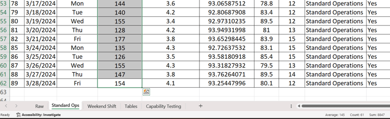
Any deviations, missing values, and similar issues must be corrected before you begin the actual baselining. This must be done because during the exercise you will be doing a lot of calculations, and if you have low-quality data, the results will be impacted. Clean data = good results.
Outliers and other abnormal values
When trying to establish a baseline (which is nothing more than a point of reference based on available information), you need to check if you have outliers or abnormal values.
Abnormal values will mess up your end results, especially when they are rare, which is why they need to be filtered out and removed if necessary. If, for example, you had one person with one very bad day that generated a much lower handling time, there’s no need to leave it in there. The same goes for tool issues, IT outages, etc. Exceptional cases are not to be included – they will manipulate the end results and leave you with either way too high or way too low baseline targets. Give your report a thorough check, see what values are “out of the ordinary,” and remove them.
In this step, you also try to establish if you need to layer your data, meaning structuring it based on different operational aspects. Let’s take this example of a dataset:
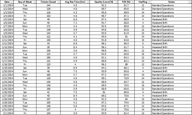
It’s a simple report with different aspects we need to baseline. We have multiple days, tickets closed, resolution time, quality score, first call resolution, and staffing for each day. We also have a split between Standard Operations (Mon–Fri) and Weekend Shifts. This is a very important distinction because, most probably, during weekend shifts things are completely different: maybe lower volumes, different resolution times, different FCR, etc. If you look at this entire dataset without creating separate baselines for Weekdays and Weekends, you will end up with a big mess (each layer will skew the other). Having two distinct baselines will solve this issue, provide far more visibility on specific metrics, and allow you to adapt the results based on reality as opposed to an estimated or “desired” reality.
The Calculation
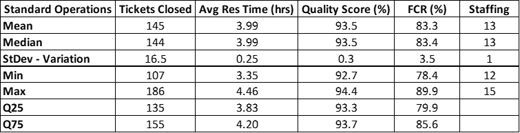
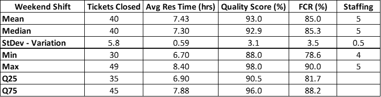
With a clean, structured, and complete dataset, we are all set to begin the baseline. Here are the main aspects we look at when establishing a baseline as a first-time manager:
- Mean: the average result of your dataset. Excel formula: =AVERAGE()
- Median: the exact middle value. Excel formula: =MEDIAN()
- Standard Deviation: the variation of your data. Formula: =STDEV(). Here you will have two options: either .P (stands for Population, used when the data represents the entire population) or .S (stands for Sample, used when looking at a sample of the data).
- Min: the lowest value. Formula: =MIN()
- Max: the highest value. Formula: =MAX()
- Q25: the 25th Percentile (1st Quartile) of your data. Formula: =QUARTILE.INC(). Here you also have two options: either QUARTILE.INC (takes into account every data point, including minimum and maximum) or QUARTILE.EXC (excludes extreme minimum and maximum values).
- Q75: the 75th Percentile (3rd Quartile) of your data. Same formula as above, just selecting the 3rd quartile.
Visual Aid
To better help you see what is going on with your process, we can create a Control Chart for each KPI to visualize the data.
A Control Chart is a trend-line chart with two additions: a lower control limit and an upper control limit. To make things easier, let’s use “Floor” as a description for the Lower Limit and “Ceiling” for the Upper Limit. Normally, these limits are calculated using statistical formulas, but since we are not writing an academic statistics paper and just want a reliable, quick, and painless baseline, we will use the 25th Quartile as the Floor and the 75th Quartile as the Ceiling. We are doing this because it is much closer to daily operational usage and honestly easier to implement for someone less experienced.
Now, arrange your data in a table like this.
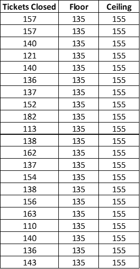
Select the entire table, go to Recommended Charts, and the first option you will see is the Control Chart. You might need to play around with the Axis Numbers and select smaller or bigger scales if the chart is too crowded. It looks like this:
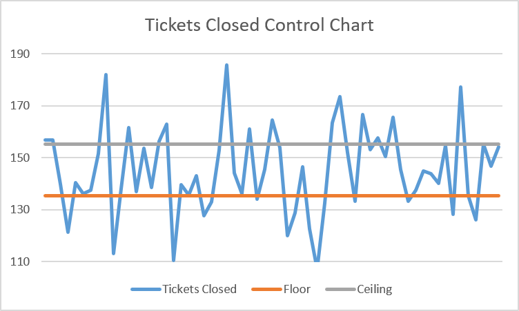
In it, you can see how (in my case) ticket volume flows across each day compared to the Floor and Ceiling. This will give you an idea of how much your values stay inside or outside these limits: the more points outside them, the more variation you have. Remember that variation is something we don’t want in processes – it triggers major issues, causes uneven work distribution, generates higher error rates, and leaves you vulnerable to penalties, attrition, and customer dissatisfaction.
The Baseline
With all these calculations established, it is now time to talk about what we actually use as a baseline. In the Calculations section, we talked about Mean, Median, and Variation (Standard Deviation). These offer the most important picture of your data, and based on these three, we extract the baseline. Here are the main aspects to consider:
- Never use the Average as a Baseline: the mean (or average) is very sensitive to extreme values, and any outlier will increase or decrease it significantly. Sadly, I see many operations managers using the average as their go-to metric when they should be using the median.
- Always use the Median: the median is less influenced by extremes because, by default, it does not get pulled by outliers. Because of this, it is an indicator much closer to the reality of what your team is capable of. Remember: the median is always your baseline.
- Look at your Variation: this should be your main trigger point, because the higher it is, the more your process suffers. High variation means results between team members are wide apart, meaning you need to investigate what is going on: it could be workload distribution, a training issue, a system issue, improper customer segmentation, etc.
Establishing Your Targets
This is a big topic to cover, but I am sure you have heard this before: “If everyone is hitting 100% of their target, your targets are too low.” Or how about posts like: “Aim for the moon so if you miss, you’ll land among the stars,” or “Hire self-starters who set their own aggressive targets”? These are examples of ridiculous social media posts that have no real operational basis, are a complete waste of time, and do more harm than good.
On a similar note, upper management isn’t always far off from these examples, offering “brilliant” advice like: Top-down mandates (the “Just Make It 20% Higher” rule), ranking and stacking staff against the target average, or metric stacking (setting aggressive targets for speed AND quality simultaneously).
The best thing you can do as a first-time manager is to NOT LISTEN to any of this. It’s not grounded in reality, there’s no statistical evidence it works, and it will give you the wrong idea about how targets need to be set. Setting up proper targets is a more nuanced subject, so let’s look at the appropriate way to deal with it.
Define the 3-Tier Target Band (Floor, Baseline, Stretch)
Never set a single, static number. A healthy operational target is always expressed as an operating band that accounts for natural day-to-day variation.
- Floor: 25th Quartile. Falling below this number isn’t a reason to punish staff; it’s an early warning alarm that triggers a quick check for system bugs, queue issues, or staffing shortages.
- Baseline: The median. This is your standard, day-in-day-out operational capacity for routine planning and scheduling.
- Stretch: 75th Quartile. Used as a benchmark for peak performance under current tools and process steps.
Validate Target Capability
Proper target setting – especially for targets communicated to stakeholders – must follow a capability analysis check. Process capability measures process width, meaning how reliably your process stays within Upper and Lower Limits based on historical data.
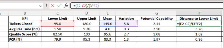
To calculate it, we start with a simple table containing your Lower Limit (Floor), Upper Limit (Stretch), Mean, and Variation (Standard Deviation).
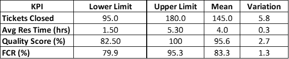
Next, we establish the following:
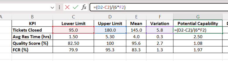
- Potential Capability: (Upper Limit – Lower Limit) / (6 * Variation)
- Distance to Lower Limit: (Mean – Lower Limit) / (3 * Variation)
- Distance to Upper Limit: (Upper Limit – Mean) / (3 * Variation)
- Actual Capability: MIN(Distance to Lower Limit, Distance to Upper Limit)
Now we check the Actual Capability, and based on the result, we establish whether the target is achievable:
- < 1.0: Not Capable. The process generates defects/out-of-spec errors regularly.
- Between 1.0 – 1.33: Marginally Capable. Barely fitting; small performance swings cause defects.
- 1.33: Capable. Standard industry target; stable with low defect risk.
- >= 2.0: Six Sigma Level Capability. World-class quality; practically zero defects.



Align Inputs Before Moving the Goalposts
If upper management demands that the current stretch target (75th Quartile) becomes the new daily baseline average, follow the cardinal rule of operational management: You cannot raise output targets without first reducing process variation or removing operational friction.
To permanently shift your target band upward, you must change one of three inputs:
- Reduce handle times: Streamline manual workflows, clear system lag, or eliminate redundant logging steps.
- Standardize training: Bring low-performing outliers closer to the mean through targeted coaching.
- Automate repetitive tasks: Use scripts, macros, or better routing tools to absorb low-complexity volume.
Socialize and Review on a Fixed Cadence
- Frame the targets transparently: Show the team the underlying numbers (the 25th–75th Quartile range). Explain that landing anywhere inside the band is a success, hitting the 75th is a win, and falling to the 25th is simply a signal that support is needed.
- Freeze the baseline: Lock targets in for a set period (e.g., one quarter). Do not adjust targets mid-quarter just because the team had two exceptionally good weeks.
- Recalculate on structural changes: Only recalculate the target band when core operational inputs change – such as new software rollouts, altered customer SLAs, or major shift adjustments (like separating weekday vs. weekend shifts).
This is everything you need to know to get started with baselining. Of course, with more experience and exposure over time, you will master it and do even more advanced things. For now, however, this framework will give you the best possible start.
Until the next one, stay healthy, happy, and safe!