
How do I prioritize the main problems causing most of my issues?
When you begin the actual job of a manager, there’s a realization, a sort of epiphany if you will: a lot of things just appear out of nowhere and must be taken care of. This is not really a big surprise, but for the first-time manager it can create a “WOW” moment, specifically when you (as a first-timer) realize that you have too many struggles to deal with and you don’t know how to prioritize them. It’s also safe to say that dealing with operational issues leaves a lot of room for error management, another complicated layer about the job that you don’t hear people talk about (that often).
Not all is lost, however, because like you and me, other people have had to deal with this for hundreds of years (safe to say even thousands). Because of this, we have a lot of solutions, and today we will be talking about one of them to teach you how to deal with the age-old question of separating the main problems causing most of your issues.
What do I need to know about prioritizing the main problems causing most of the issues in my process?
The Pareto Principle, or 80/20 Rule, helps operational managers isolate the vital few root causes behind the majority of daily issues by systematically gathering process data, sorting categories by impact, and building a cumulative chart – enabling focused, high-impact fixes, proper Root Cause Analysis, and long-term performance tracking while avoiding constant firefighting and keeping team momentum high through visible wins.
Your Pareto Roadmap:
| STAGE | FOCUS AREA | KEY POINTS |
| Pareto: The Lore | Explores the historical origins of the 80/20 Rule, from Vilfredo Pareto’s economic observations to Joseph Juran’s application of the principle in operational management. | Shift your mindset from treating daily chaos as random to identifying the few vital causes driving most of your operational friction. |
| How to build a proper Pareto Analysis | Outlines the practical steps for gathering multi-layered process data, organizing categories by impact, and constructing a cumulative chart to identify major failure points. | Collect multi-layered process data, group it into categories, sort it by impact, and calculate cumulative percentages to construct your Pareto chart. |
| The Vital Few and The Trivial Many | Distinguishes high-impact root causes from minor operational distraction, ensuring managers target the small fraction of problems driving most issues. | Separate high-impact drivers from minor distractions, targeting your root cause analysis strictly on the top contributors to performance bottlenecks. |
| Change Execution and Impact Measurement | Covers deploying low-disruption fixes, validating ongoing improvements through the PDCA cycle, and sustaining team alignment by communicating wins. | Implement low-disruption fixes, continuously track improvements using the PDCA cycle, and regularly communicate team wins to maintain alignment and momentum. |
Pareto: The Lore
Let’s hop in our time machine and go back to a time when Italy was actually the Kingdom of Italy. It was during this forgotten era that an economist and engineer, Vilfredo Pareto, observed something special and wrote about it. At some point, Mister Pareto observed in his garden that just a few pea pods produced most of the peas. Later in life, between 1896 and 1906, he worked on The Land Study, inspired by his garden observation. It was here that he got interested in observing the wealth aspect in Italy at that time and noticed that 80% of the land was owned by 20% of the people. Sadly, Pareto died in 1923 without ever having his principle named or widely used. It was Joseph Juran, a management consultant, who in 1941 actually found Pareto’s work, reviewed it, and named it the “Pareto Principle.” Today we know it either as the Pareto Rule or the 80/20 Rule.
Much like his observations about peas and land ownership, modern-day processes must deal with a lot of struggles. While this is part of the job, the main issue is that all these struggles appear to be chaotic in nature and most of the time, especially for first-time managers, it’s difficult to pinpoint what is causing them. Think about your own work and the process you deal with: how many issues do you have in a given day, and how easy is it to actually name the main culprit? And don’t say “lack of attention”; we talked about this in this article, you know better by now: Root Cause Analysis (RCA): The Starter Pack.
The reality of daily operations appears to be very complicated, but it’s really not: you are just missing the proper tools to make it less quantum physics and more “I completely get that.” This is exactly what The Pareto Principle is: a tool to help you figure out how things are, put a bit of order in the chaos you are dealing with, and help you observe things that “the naked eye” usually can’t. The idea is simple: most of your issues (80% more or less) are caused by only 20% of your problems.
Let’s say you have this type of report: date, ticket ID, Delay category, Duration, and Escalation Level. A very basic and simple file with every ticket and the delay associated with it.
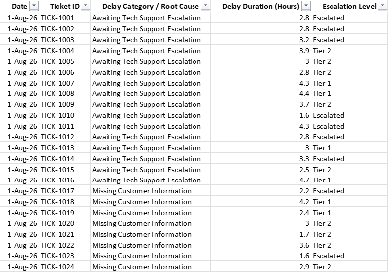
Just by looking at it, you can’t tell what is actually causing most of your issues. As in most cases from daily operations, “naked eye” checking is just not enough to establish proper causality. Unfortunately, a lot of managers have this desire to prove how much they know or how much they can do, so they just skip any type of data analytics (when provided with a similar example like the above report), eye-check it, and then formulate some bizarre “I know better” theory about it. When they do this, instead of actually fixing the thing(s) that is (are) causing all the little issues, they just end up in this long loop of always firefighting everything. You don’t want that; don’t spend 80% of your time firefighting.
How to build a proper Pareto Analysis
Let’s do a short recap of what we know so far: the principle states that 80% of your issues are generated by 20% of your problems. It’s a simple principle and it works every single time; just wait and see. To build the actual analysis, we need to gather our data, build the chart, and isolate the “vital few” (more details on this below). After you have these done, it’s only a matter of executing the changes and measuring the impact.
Data gathering is not just about the raw report you have. To put things into perspective, let’s assume we start out with a very simple situation: we are working in a support department and we keep getting feedback that things are not working as they should and we need to fix them as fast as possible.
We start out with a very simple and basic report: days and the number of tickets each day. Something like this:
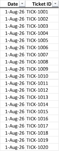
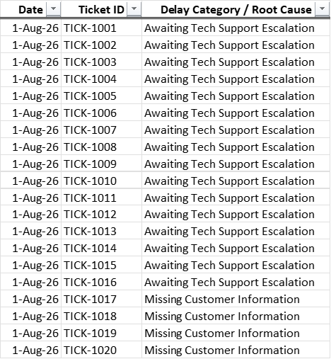
I was saying above that data gathering isn’t as simple as looking at a report and being done; it has more layers to it. This tickets-per-day view is great, but it lacks information: how do I know which ticket has issues? So, we start there and build a proper database from it. We can add, for example, the Delay Category (or Root Cause) once we have it:
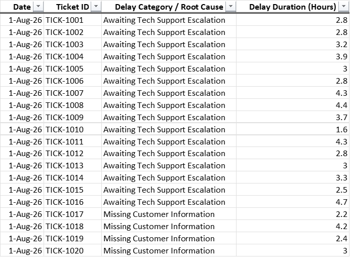
But that is also not enough for a proper analysis, so we need more. In this case, as we already have the RCA, maybe we can add the Delay Duration (in hours); this way we can see things from a different angle and also come to the table with a bit more information:
And finally, to make things fully complete, we can also add the Escalation Level:
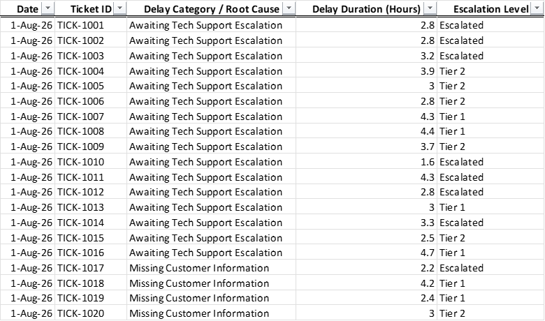
This is now turning into the exact thing one would need to create a proper Pareto analysis. See, in the end, it is not as simple as copy-pasting whatever raw report you have and being done with it; you also need to study the subject in detail and gather absolutely every little aspect that helps you paint the best possible picture of what is going on. Think about it like exploring: the more you uncover, the better it is.
I insisted on this gathering aspect because I saw a lot of managers just guessing and not doing any proper drill-downs when they have issues. While sometimes, with some very limited exceptions, you might get a manager who is very well trained in the subject (or has years of experience and a good “gut feeling”), most of the time this “let me guess what happened here” is a downfall. Preparation is key to any meaningful analysis.
Another aspect you need to take into account is the amount of data you will be gathering and the pressure on your team. Don’t overcomplicate the situation by putting 20 people to work on something that in the end will have no meaningful outcome. Approach this with care and consider simple ways to collect data – activities that will not be a major disruption for your team.
It helps if you turn your focus to the frequency of operational bottlenecks when trying this approach, as they are the cornerstone of the Pareto. Spend your time checking what is causing a bottleneck and try to get the frequency.
Building the Pareto is as simple as apple pie now because the biggest effort was already done: your data is neatly packed into categories, so you don’t have to worry too much about the outcome. In our example, we have a solid report with tickets, delay reason, delay duration, and escalation tier.
Our next step is to gather all this raw information into an appropriate table, an overall view if you will, something like this:
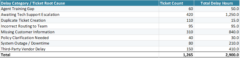
We have the Delay Category, the Ticket Count, and the Total Number of Hours of Delay. From this, we can now create an appropriate Pareto check. Remember, the goal is to see which of these categories has the biggest impact. Looking at the table, you might have some issues with that because it’s hard to really see what is causing what. We fix this by sorting the table from highest to lowest. Now it will look like this:
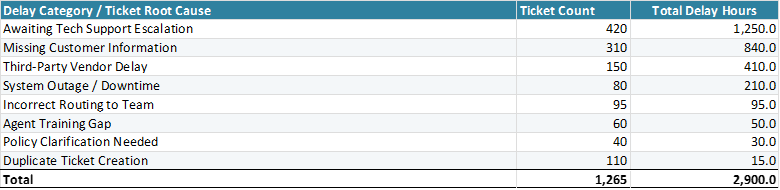
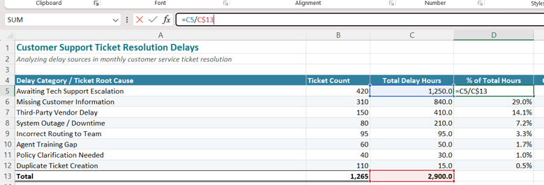
We can already tell some of these things, but let’s just continue and see what the end result looks like. Next, we must check the percentage of hours each category has compared to the total number of hours. We have a total of 2,900 hours of delay, with each delay having a specific percentage of that (awaiting tech support, for example, has 1,250 or 43% out of those 2,900):
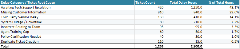
To do this, we just divide each category’s total delay hours (column C in my case) by the Total Number of Hours (C13 in my case, or 2,900).
And finally, we need to extract a cumulative percentage.

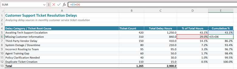
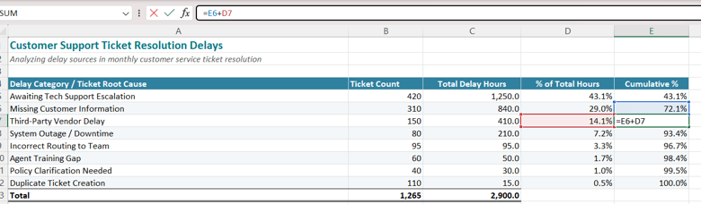
To do this, we start out with the biggest percentage – in our case, the 43.1% (the first one). This will be the first Cumulative %. Every other line from the last column will now follow this formula: previous cumulative % + current % of Total Hours (the current line in Excel). All you have to do is move one line down and change the data: previous cumulative (your previous line from column E, in my case) and the % of Total Hours from the line you are currently on.
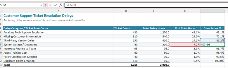
With this done, all you need to do is create the chart. You can use the Delay Category column, the Ticket Volume (or Delay Hours – whichever you prefer), and the Cumulative %.
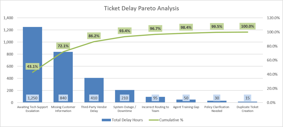
Now when you look at it, you can see your Top 3 (in my case) reasons causing the biggest possible volume: Awaiting Tech Support, Missing Customer Information, and Third-Party Vendor Delays. Out of 2,900 hours of delay, these 3 categories are generating 2,500 (86.3%), and with a volume of 880 tickets out of 1,265, I can safely say I found what we call the Vital Few Causes.
The Vital Few and The Trivial Many
Vital Few and Trivial Many are something we spoke about in this article as well: Fishbone Diagrams (Ishikawa) for Complex Issues. The basic idea is to have a clear separation between what is actually relevant and what is not. In our example, ask this question: what good would it do for the overall situation if right now I focused on Duplicate Ticket Creation and Policy Clarification Needed? If my immediate need is to take care of the huge number of escalations and the feedback I am receiving, 45 tickets will not make a big difference in perception (compared to 2,500).
With a clear picture of what your main drivers are, you can now dedicate time to doing a proper RCA on them. A great tool for this would be the Fishbone Diagram, as it can help you map out multiple categories and sub-categories of factors for a better picture. Just remember that some will be in your control and some will not. Don’t waste your time on uncontrollable factors; they will not bring you any actual results for the simple reason that you can’t do anything about them.
With your factors now on the table, focus on high-impact fixes that will bring the biggest impact. They will be the ones actually lowering the escalations. Low-impact fixes tend not to generate the expected outcome, waste investment time, and create frustration (for your team, yourself, upper management, and customers) because, at the end of the day, it’s work in vain.
Change Execution and Impact Measurement
The final stage in any solid Pareto Analysis is execution and impact measurement. You see, it’s not enough to just make the analysis; you also have to follow through and make sure whatever it is that you are doing is working.
A key factor to consider is the minimal disruption point of view: what is the point of deploying fixes if they become a source of disruption for the team? Any healthy problem fixing must be done without interruptions to daily operational life. The less impact it has on business as usual, the better it is. Sometimes I see these crazy fixes getting implemented that are so complex and heavy to deliver that they end up creating even more problems than they were intended to fix.
All continuous improvement projects have one thing in common: tracking whether the improvement stands or not. This is also a core aspect of any good Pareto Analysis. Tracking impact is all about going over the initial issues and checking to see if, after you have deployed your fix, they are still present. If they are, you need to recheck them; if they are gone, all is well. It’s a continuous cycle that keeps spinning, similar to the PDCA Cycle: you plan, you do, you check, and you act. If this step is skipped, if you just end the analysis after the fix is deployed, you’ll end up back at the beginning firefighting. Take time and do a thorough job all the way.
On the topic of execution and measurement of impact, we also need to talk about communication, but specifically something more targeted that is not always done: communicating the wins. It’s a best practice to share wins with your team, mostly because of these reasons:
- Visibility: something I can’t stress enough, especially for first-time managers who tend to leave this out of the equation. A key aspect in any leader’s book, visibility offers an area of impact far beyond the regular slide, email, or meeting: it creates a space where people feel they are actively taking part in the bigger picture, they are informed, and most times (preferably) consulted, and because of this, they better understand what is actually happening.
- Motivation: what is the point of fixing things if not to keep the team spirit up and people engaged and happy? After all, fixes are primarily done because issues cause a lot of process friction, a high risk of attrition, and waste. All these aspects trace back to one thing: motivation. The more motivated people are by your wins, the more they will get involved, the happier they will be, and the better the process functions.
- Alignment: wins coupled with visibility and motivation create alignment, and on multiple layers at that. You need people not just to know what is happening and to feel motivated; you also need them to be aligned with the core business, the direction… to believe in the overall goal. If they see your wins, they are more likely to trust the plan.
Before we end our lesson, here are some other examples you can use to practice your Pareto skills, now that you are an expert on the topic.
| Fulfillment Bottleneck Reason | Order Count Impacted | Delay Duration (Hours) |
| Out of Stock / Backorder | 540 | 3240 |
| Customs Clearances / Documentation | 210 | 1890 |
| Warehouse Packing Bottleneck | 380 | 760 |
| Address Validation Errors | 190 | 285 |
| Carrier Pickup Delays | 120 | 240 |
| Payment Processing Hold | 85 | 170 |
| Label Printing System Failure | 45 | 45 |
| Total | 1570 | 6630 |
| Defect Module / Subsystem | Bug Count | QA Delay Hours |
| Payment Gateway API | 88 | 440 |
| User Authentication / SSO | 64 | 256 |
| Database Migration Scripts | 32 | 160 |
| UI Layout & Responsiveness | 115 | 115 |
| Export to CSV/PDF Module | 45 | 67.5 |
| Email Notification Service | 28 | 42 |
| Localization / Translations | 50 | 25 |
| Total | 422 | 1105.5 |
| Equipment Failure Mode | Incident Occurrences | Downtime (Hours) |
| Conveyor Belt Jamming | 48 | 126 |
| Hydraulic Press Seal Failure | 18 | 90 |
| Sensor Calibration Errors | 65 | 52 |
| Motor Overheating | 12 | 36 |
| Robotic Arm Alignment Loss | 8 | 24 |
| Power Supply Fluctuation | 15 | 15 |
| Operator Panel Unresponsiveness | 22 | 11 |
| Total | 182 | 354 |
And with that said, remember: continuous improvement must be an ongoing habit, not a one-time task, and Pareto falls right in the middle of this statement. It is a core 7 Quality Tool, and as such, it follows the check, improve, and act framework.
Until the next article, stay happy, healthy, and safe!