
How Do I Brainstorm Root Causes When a Problem Has Multiple Drivers?
In the new world of corporate noise, with so many problems at every step and constantly moving and fixing, it’s no wonder people (at times) feel like they spend more time fixing things than actually doing the job they are supposed to do. While sometimes this can be the case when you are dealing with very poorly managed processes, most times it’s all about picking the right tool and investing the effort in the correct direction. Such is the case with complex issues and how people decide to manage them. For a first-time manager, this can be a struggle, more so if they are not trained in or familiar with any continuous improvement methodology.
What do I need to know to extract the root cause when a problem has multiple causes?
By combining cross-functional expertise, open-ended problem statements, and the structured 6 Ms framework, first-time managers can use Fishbone diagrams to depersonalize root-cause analysis, separating surface-level symptoms from underlying system failures, while 5 Whys techniques, stakeholder voting, and Pareto analysis help pare down complex operational issues into vital, actionable priorities that ensure clear team ownership and measurable accountability.
Here is your Fishbone Diagram Roadmap:
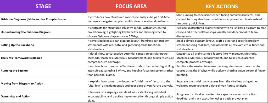
Understanding the Fishbone Diagram
We spoke a bit about this topic in the article Root Cause Analysis (RCA): The Starter Pack, and while it’s only a basic overview, it can help you get a better grasp of what RCA is all about. Now, I want you to look at this entire RCA as a very simple task: you have a problem that is causing you headaches in your process; you don’t know what is causing all these issues, so you start using different tools to get to the bottom of it. The principle is simple; however, problems are rarely the result of one single cause, and most of the time the sad reality is this: one problem, multiple causes. In this case, you need to invest all your effort and make sure you select the right tool for the job. One of these tools is called a Fishbone Diagram, or Ishikawa diagram.
Normally, you hear words like “brainstorming” when something is happening and people need to understand it, but brainstorming is not really an effective tool in this case. Usually, these sessions end up being a noise contest, with the loudest person in the room monopolizing the entire conversation. Worse, multiple people start talking over each other and you have yourself a good old-fashioned TV debate, but inside your team. Another reason brainstorming falls short in such cases is that it does not have an actual structure, and when multiple factors interconnect to create a problem, it’s very hard to pinpoint them if everyone is talking about everything. I know some leaders might say, “Well yes, but I can be there to guide the discussion and add the structure,” but the truth is you can’t. It’s not effective, so save brainstorming for another time.
Mr. Kaoru Ishikawa created this magnificently simple tool back in 1960 as a visual anchor to force people to stop jumping to conclusions and start mapping cause-and-effect relationships systematically. These are the main benefits of the fishbone diagram:
- Separates symptoms from root causes: It forces people to look past the surface noise (e.g., “sales are down”) and map the underlying drivers creating that outcome.
- Enforces structured coverage: By forcing ideas into predefined categories (like the 6 Ms), it prevents the team from fixating on just one department or blaming a single team member.
- Depersonalizes the conversation: Instead of pointing fingers at people (“Operations messed up”), team members point at the board and analyze process failures.
- Reveals hidden patterns: When you map multiple ideas visually, you quickly see clusters, revealing that three seemingly unrelated issues actually stem from the exact same process bottleneck.
Sometimes you might be confused about choosing between a Fishbone diagram and a classic 5 Whys analysis, so here is a quick overview to help you decide:

Here are some relatable examples for each, in case you need something a bit closer to home:
- When to use 5 Whys: A customer didn’t receive their invoice because an automated email failed, or a server crashed because a storage volume filled up. There is one straight line between cause and effect.
- When to pull out the Fishbone: Project handoffs are consistently failing, product quality is declining across multiple lines, or team velocity dropped after a reorganization. If you ask “Why?” and immediately get five different answers from five different departments, stop and build a Fishbone.
As a first-time manager, you must remember to never jump to the conclusion that people are automatically lazy or that you know best why this is happening. Instead of using judgment, use a fishbone: systematically map out the causes of your problem and use your team to do so.
Setting Up the Backbone
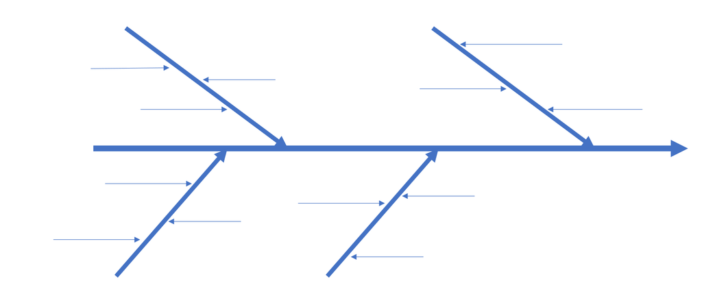
The first thing we need to do is to create a good-looking structure on which the entire analysis will stand. There are tons of templates out there, but here are two very simple ones:
A PowerPoint example – a bit more visual
An Excel example – this should be the first one created; you can then follow up with the PowerPoint version if you need it to be a bit more visual.
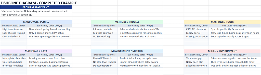
Now that you have created your diagram – at least the structure – you need to add the problem. Here, you need to consider CLARITY above anything else, because most failed RCAs are due to the lack of a proper problem statement. When a statement is very vague, unclear, or too general, it’s very difficult to start looking into the exact causes or even try linking some of them to the problem (as you don’t really know what the problem is). This happens very often in Lean and Six Sigma projects and is a major part of the introductory theory of both frameworks.
Sometimes, customers or upper management will present a very generic or basic issue that they say is a problem right now and expect you to fix it. But you can’t fix what you don’t understand, so start by asking open-ended questions to get to the actual issue. Here are some examples to help you relate:
Operations & Customer Experience
- Bad: Customer support is doing a terrible job and response times are awful.
- Good: Tier 1 customer support average response time increased from 15 minutes to 4 hours in Q3.
Software & Tech Infrastructure
- Bad: The app keeps crashing and IT can’t fix it.
- Good: Mobile app unhandled crash rates spiked by 18% following the v4.2 release on iOS.
Human Resources & Hiring
- Bad: We aren’t hiring good people anymore and turnover is high.
- Good: 90-day voluntary turnover for new sales reps increased from 5% to 22% between January and June.
Supply Chain & Logistics
- Bad: Deliveries are always late because vendor communication is broken.
- Good: On-time order delivery rate for Region East dropped from 96% to 78% during Q2.
Sales & Revenue Pipeline
- Bad: Sales rep deals are falling through at the last minute.
- Good: Contract win rate for mid-market deals in the final negotiation stage dropped from 45% to 20% in H1.
Your next step is to gather all the appropriate stakeholders in one room. This means looking at all cross-functional people who might be connected with the specific problem you have and bringing them into the discussion. There’s really no point in trying your best with your team if you lack someone from HR or Sales. Ultimately, you’ll end up asking them anyway, or worse, you’ll implement whatever fix you think is correct when it is not.
With all these people on board, it’s time to set up the rules. Don’t let the meeting degenerate into a crazy show of skills, experience, and power. People can at times be like little kids, and you as a leader should be aware of this: they need someone there to take control, command the meeting, set up the rules, keep time, take notes, and ensure people are following the structure. Without structure, it’s just a free-for-all type of meeting, and it won’t be pretty – trust me!
The 6 Ms Framework Explained
With the preliminary work done and the team gathered, it’s time to place each of the identified causes into the 6 Ms. They are:
- Manpower: Looking at human factors, training, and workload without placing blame
- Methods: Examining processes, handoffs, and procedures
- Machines: Checking tools, software, equipment, and technology
- Materials: Evaluating raw inputs, vendor supplies, and data quality
- Measurement: Assessing metrics, inspection standards, and data accuracy
- Milieu: Considering environmental factors, team culture, and workspace conditions
A good practice to keep in mind is to reach a general agreement on each identified cause, its impact on the problem, and its classification into one of the Ms. Use data as much as you can, especially to validate the impact, but remember that some things might not have the data you need and you will just have to go by expert opinion (just make sure that person is indeed an expert).
Running the Session
Like any other problem-solving exercise, you need to start BIG and move to small. A lot of people in similar scenarios tend to start out small (usually with exceptions) and then move to bigger or more general things. This is a mistake because if you start with the exceptions, you can’t fix something that is only applicable to 5% of your population. Identification and classification of causes should start with the major 6 Ms. Once a cause has been identified, agreed upon, and classified, that is when you deep-dive (aka go into the small).
For each major cause, you might have sub-causes that are equally important and must be on the table in order to have a complete picture of what is going on. A Fishbone is not just about 3–4 major causes you managed to locate, but also about the smaller ones that impact those 3–4 bigger ones. This is one of the failure points in these sessions: people tend to forget that tackling a bigger problem all at once may not be viable, which is why looking at sub-causes is a better idea. You can do this by using a 5 Whys exercise, asking “Why?” repeatedly until you reach the exact sub-cause you think is correct.
Because we are dealing with people, you need to keep them in check by directing them to system-related issues rather than pointing fingers at other people. Yes, I know we are back to this, but a side effect of human interaction is the personal aspect: pointing fingers at another person is just easier than trying to figure out the real issue (plus, it’s a great occasion for some individuals to air out different layers of frustration). You must not allow this to happen; your job is to govern the entire session and keep it on track.
Moving from Diagram to Action
Now that you have an almost-finished product, it’s time to move from words to action. A first step is separating the “trivial many” causes from the “vital few” causes. This is a concept we use a lot in Six Sigma projects, and the objective is simple: you have one problem caused by (let’s say) 20 factors. Realistically speaking, you can’t change all 20 factors – it’s just too much. Some might be in your control and some might not, so you need to decide (as a group) what you can and can’t change. The vital few are those few factors (causes) that you can focus on, improve, or remove completely from your problem. The rest are just noise, not relevant, or out of scope.
There are many ways to identify which factors to focus on, whether statistical in nature or simpler for a less analytical group. I would recommend two such ways:
The Voting Way
List all the causes, and have each person score each cause on a scale of 1–10 without the others knowing what they scored, then add all the numbers up. The top 4–5 causes with the highest scores are the ones to focus on. If you want to assign a weight to each person’s vote, you can do that as well or adjust this method whichever way you want.
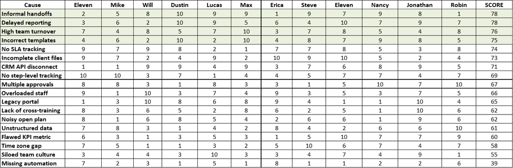
The Data Way (Using Pareto Analysis)
Instead of asking people to vote on what feels important, Pareto Analysis looks at actual historical occurrence data to identify which few causes generate the vast majority of your problems.
How it works:
- Pull historical logs or tracking data related to the problem (e.g., ticket categories, defect logs, downtime records).
- Count how many times each specific cause triggered an issue over a set timeframe.
- Sort the causes from highest frequency to lowest and calculate the cumulative percentage.
- Focus exclusively on the top 20% of causes that drive 80% of the defects.
Let’s say you have a table of data for your analysis.
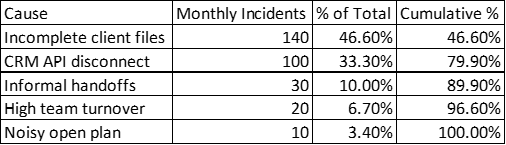
Using Excel, select the Cause, Monthly Incidents, and Cumulative % columns and go to Recommended Charts – Excel will recognize the data structure and list Pareto as the first option.
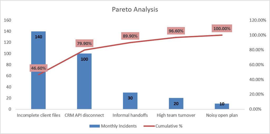
With that done, you move to OWNERSHIP and ACTION.
Each individual at your table is part of a bigger problem, and it’s up to you – the leader – to provide ownership and assign action items to them. Give people the power, confidence, and opportunity to contribute to the bigger picture. Make sure action items are written down and that each person knows exactly what they need to do and by when they need to do it. It helps if you have a basic project plan – a simple table in Excel will do just fine – listing the person, the action item, and the deadline. Follow up regularly and make sure things stay on track.
Until the next one, stay healthy, happy, and safe!