
What should I take into account when building an SLA or KPI performance dashboard for my team?
With a new job comes a lot of responsibility along with new and interesting tasks. One of the most crucial tasks, if not the most crucial, is displaying performance. Team and project performance are strictly tied to contractual obligations, and as such, they play a pivotal role in how a business is managed.
Let’s say your team is working on a customer support line of business, and the agreement with the customer (or your internal target – in other words, what was promised to the end users calling in) is a maximum waiting time of 3 minutes. To better understand why so much pressure goes into performance visibility, we need to look at how it works from a different angle. Achieving this target is how your project gets paid. Payment feeds directly into headcount, job stability, bonuses, promotions, basically everything that makes the project a success. Any breaches from this standpoint result in “not-so-pleasant” consequences: penalties, contractual changes, capacity reductions, and so on. This is why performance visibility (tied to contractual commitments) is a very serious and critical aspect of a manager’s job.
What do you need to know when it comes to performance dashboards?
Displaying team performance is critical for meeting targets, but cluttering dashboards with dozens of SLAs triggers cognitive paralysis. Ground your reporting in science: limit yourself to 5 to 7 key metrics using the “Rule of 5-7” (1 Primary North Star, 2-3 Pace, and 2-3 Guardrails). Layout data in a natural F-pattern with RAG visual status. Keep it simple and focused, even Excel gets the job done.
With that out of the way, here you are! It’s time to talk about SLAs, KPIs, and how you should display them.
If you’ve ever worked in a corporate environment, by now you should be familiar with the standard type of SLA display: you know, those PowerPoint slides with tons and tons of SLAs all clumped together like some big pancake breakfast from a Hallmark movie. You look at them and say, “Wow, that is something else,” and it is, because most of the time it’s simply the wrong way to handle things.
The first-time managers RoadMap
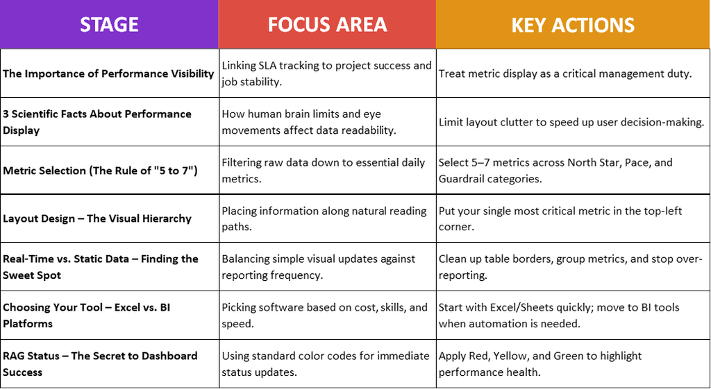
3 Scientific Facts About Performance Display
1. Cognitive Load and Decision Paralysis
Sweller’s Cognitive Load Theory states that at any given time, people are usually able to process about 4/1 chunks of information simultaneously. This translates to a simple 2 x 2 grid (2 rows, 2 columns).
When you open a dashboard with 15+ SLAs, the brain experiences extraneous cognitive load – that sudden “Wow, I have no idea what I am looking at” feeling – leading to choice overload and slower decision-making. We simply can’t digest what we are looking at on the spot, so we need more time to process it. It’s like buying a product you don’t normally shop for: you go online or into a store, get hit with dozens of options, and need extra time to sort through them.
Here are some interesting statistics:
- 34% faster execution: Studies show that reducing visual options from 10+ down to a clean, organized hierarchy increases decision-execution speed by up to 34%.
- 70% time savings: A structured dashboard can reduce the time spent researching information by up to 70% compared to an unstructured one.
2. The F-Pattern Eye-Tracking Behavior
Extensive eye-tracking research done by Nielsen Norman Group reveals that readers in Western cultures scan digital interfaces in an “F-shape” (or E-shape) starting horizontally across the top-left, dropping down slightly for a second horizontal pass, and then scanning vertically down the left side.
Some interesting statistics on this:
- Top-Left Focus: Eye-tracking heatmaps confirm that the top-left quadrant receives nearly 80% of initial gaze time on a new screen.
- The Drop-Off: Information placed “below the fold” or outside the natural scanning path suffers an over 80% drop-off in user engagement.
3. The “5-Second Rule”
Our visual cortex processes visual attributes like size, position, and visual hierarchy via preattentive processing – meaning the brain detects them in under 200 milliseconds, long before conscious thought kicks in.
In a clean and structured dashboard, this allows a manager and their team to immediately register overall team health without active reading or doing mental math.
Here are some stats on this:
- Rapid Evaluation: According to dashboard usability benchmarks, effective operational layouts allow managers to evaluate the state of play within 5 seconds or less.
- Fewer Errors: Standardizing metric visuals with a clear hierarchy reduces visual interpretation errors by over 40%.
Now that we better understand the science behind it, we can collectively state that messy dashboards are bad and we need a clean, structured way to present them – otherwise, people simply won’t follow them. To achieve this, we need to follow a few simple steps.
Step 1: Metric Selection (The Rule of “5 to 7”)
When designing operational dashboards, you should focus on the performance most relevant for your team. Leave high-level strategic goals for upper management (like annual revenue) and deep-dive root-cause data for secondary analytical sheets.
Select 5 to 7 SLAs and spread them across 3 distinct categories:
- Primary North Star (1 metric): The single most important operational indicator you have. Everyone on the team should know this number. Examples: Unresolved Critical Tickets, Units Shipped Today, On-Time Delivery Rate (%).
- Capacity and Team Pace (2–3 metrics): These tell you how fast work is moving and whether the team has bandwidth or bottlenecks. Examples: Daily Output vs. Target, Average Cycle Time, Queue/Backlog Volume.
- Quality & Health Guardrails (2–3 metrics): Speed means nothing if quality drops. Guardrail metrics ensure speed doesn’t compromise standards. Examples: First-Contact Resolution Rate, Defect/Error Rate (%), Escalation Count.
Selection Rule of Thumb: For every metric you want to add, ask: “If this number suddenly turns red, what specific action will someone take today?” If there isn’t a clear daily action attached to it, remove it.
Step 2: Layout Design – The Visual Hierarchy
The way data is presented matters most. Since people normally read information in an “F-pattern” starting at the top left, scanning across, and then moving down, it’s recommended to place your most important metric in the top-left corner. Next to it (on the right), place your secondary metrics, and follow with your guardrails below.
Step 3: Real-Time vs. Static Data – Finding the Sweet Spot
The traditional layout often relies on a standard table showing dozens of SLAs, target values, and multi-level timelines: Week-to-Date (WTD), Month-to-Date (MTD), and Year-to-Date (YTD).
Take 30 seconds to look at a typical dense table and ask yourself: Out of all these numbers, which SLA is actually the most important right now, and how are we doing against it?
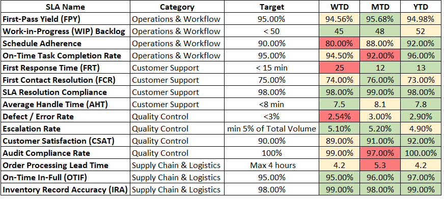
Now let’s look at this picture and repeat the experiment.

As you can see, it’s much easier when you make a few small changes, nothing major (it’s the exact same Excel file!): remove the heavy table borders, add light transparent shapes around each SLA category, place a simple divider line beneath the SLA name and actual data, and give it a bit of oomph!
I specifically chose the Week-to-Date (WTD), Month-to-Date (MTD), and Year-to-Date (YTD) views because this is the most common format, especially when reporting to clients. The reason behind it is simple: stakeholders want to see progress across multiple horizons. Having weekly, monthly, and yearly metrics helps illustrate how healthy the project is over time. Of course, every team and company is unique, so choose whichever timeframe best fits your team and customer needs.
When it comes to real-time versus static data, the decision boils down to impact versus effort. Real-time data is demanding – it requires solid IT infrastructure, dedicated software, and ongoing maintenance costs. If the costs outweigh the benefits, sticking with traditional static reporting is completely fine.
My Golden Rule for Reporting: DO NOT overwhelm your teams with endless reports. Sometimes less is more, and we need to remember that more information isn’t always better. It’s far better to deliver a single, well-structured report that highlights what the team actually needs to know, rather than sending three reports a day that everyone eventually ignores.
Step 4: Choosing Your Tool – Excel vs. BI Platforms
Depending on your project, customer, or company, several factors come into play. Some organizations already have internal reporting tools, specialized CRM features, or find themselves facing the modern dilemma: Excel vs. Business Intelligence (BI) platforms.
There’s plenty of debate around which option is superior. Some advocate for Excel because almost everyone knows how to use it, while others champion BI platforms for their advanced technical capabilities. In my experience across dozens of tools, it ultimately comes down to your operational needs and personal preferences.
Here is the quick breakdown:
- Excel / Google Sheets: Low to no additional cost (assuming your company already has the software), highly customizable, but requires manual updates (though Power Query can automate much of this) and carries a higher risk of broken formulas.
- BI Platforms (Power BI, Tableau, etc.): Require paid licenses, have a steeper learning curve, and demand data-modeling skills. However, they connect directly to your CRM, offer automated refreshes, provide rich filtering options, and feature robust security settings.
If you are at the start of a new project or team and need a quick, functional solution, Excel or Google Sheets is your best answer. With endless online tutorials, ready-to-use templates, and AI tools available to help you build, all it takes is diving in and getting started.
Step 5: RAG Status – The Secret to Dashboard Success
Red, Amber/Yellow, and Green (RAG)! These three colors are fundamental to modern corporate visual management. No dashboard, overview, or executive summary is complete without them:
- Green: Target Met
- Yellow: Slightly Below Target (At Risk)
- Red: Target Missed (Requires Immediate Action)
Final Thoughts
Before you go, keep these simple principles in mind:
- Always ground performance in data: Keep it structured, easy to digest, and delivered on a consistent cadence.
- Avoid overcrowding: Keep it simple. Align with your business and team priorities, pick your core metrics for daily/weekly reports, and offload detailed data to a separate analytical sheet.
- Work with what you have: Don’t wait for leadership or clients to approve a budget for complex tools. Your primary job is ensuring the team understands their performance. Use Excel, keep layouts clean, leverage tutorials and AI – whatever works for you.
More information about data and a quick statistics guide in these articles: I’m Not Good with Data: The Non-Analytical Lead’s Guide, Data Types: A Beginner’s Guide and Intro to Statistics: A First-Time Manager’s Guide.
Thank you for making it this far! Stay healthy, stay happy, and be good to others.